Web

BRIEF
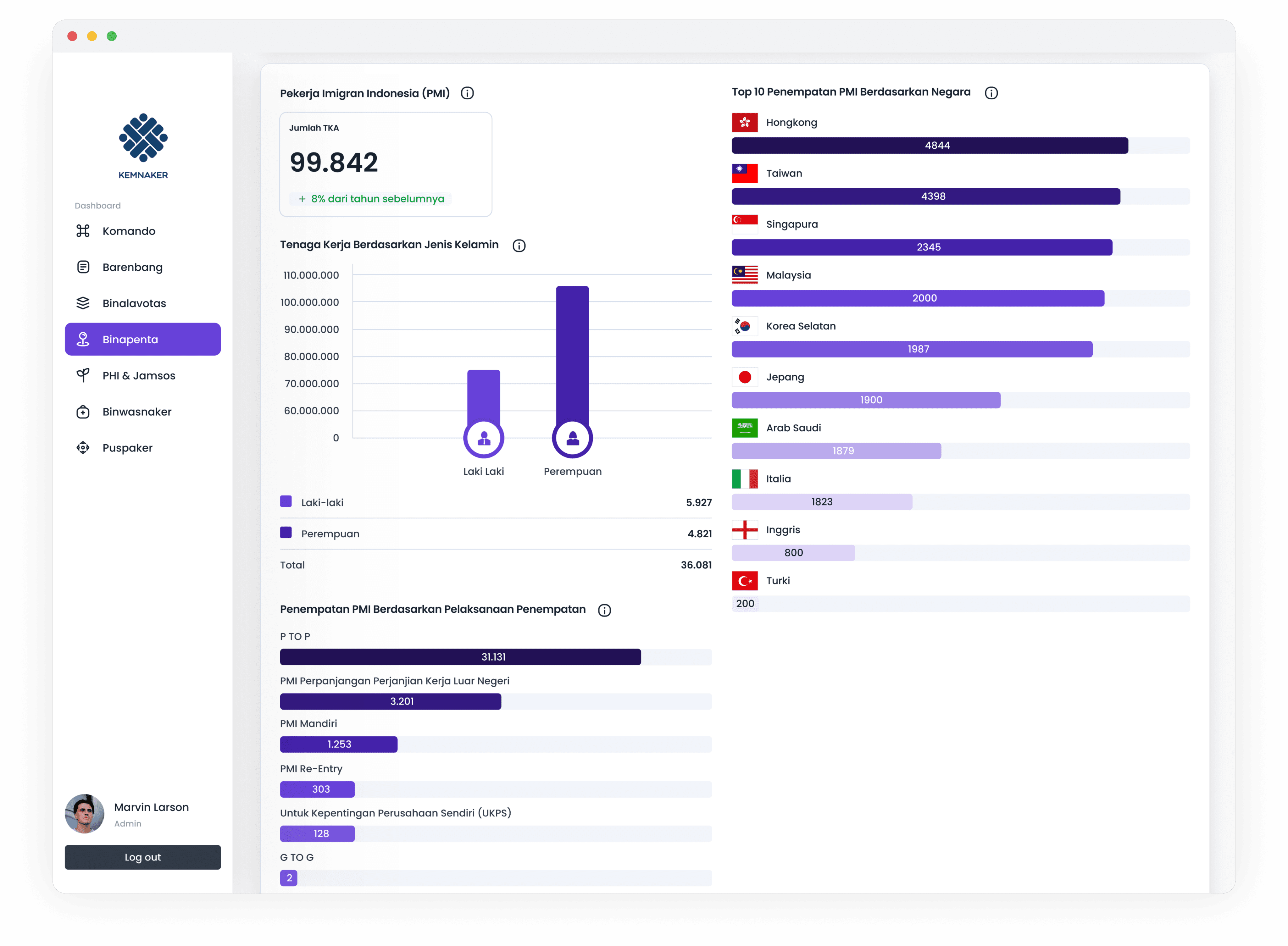
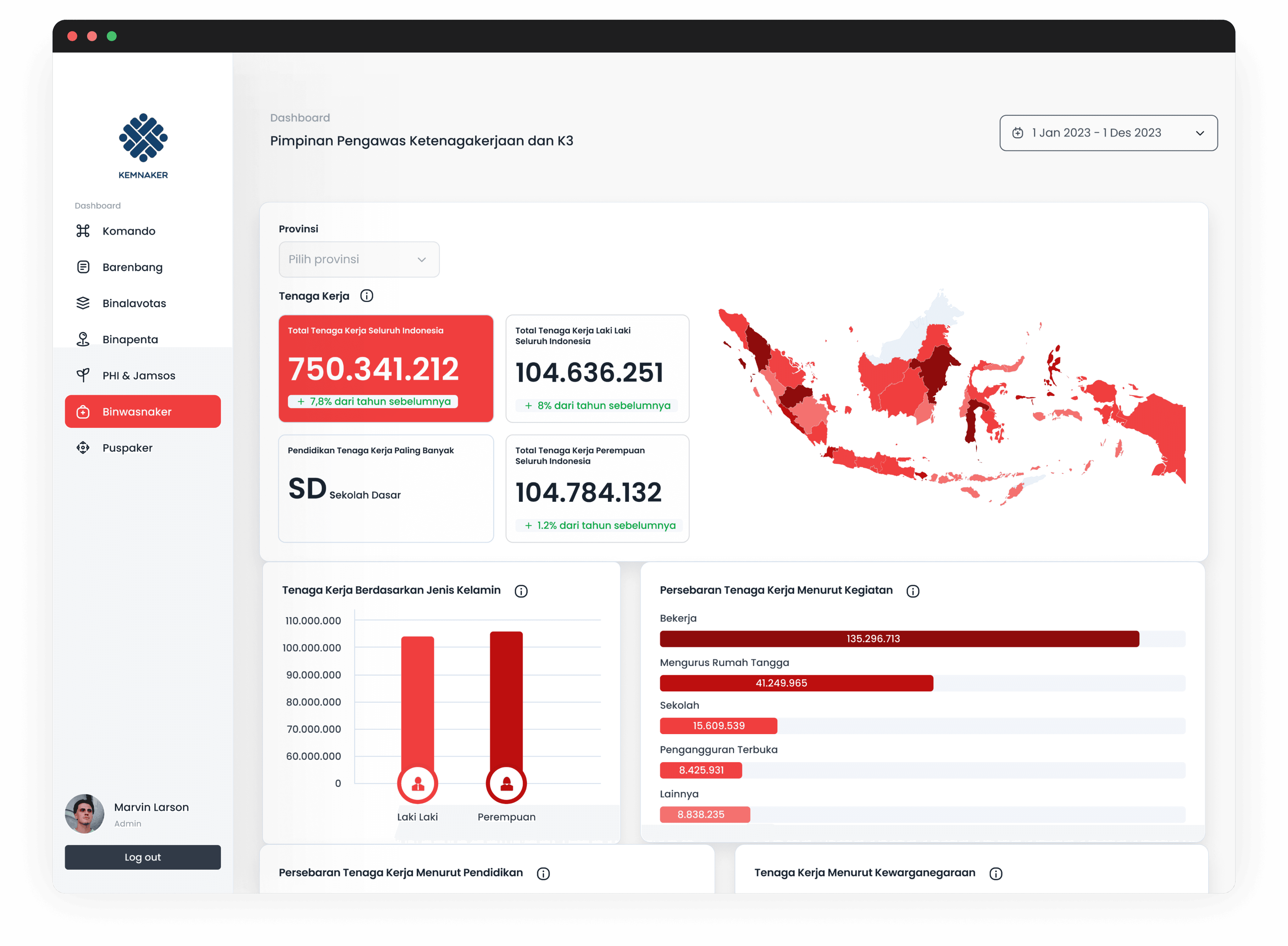
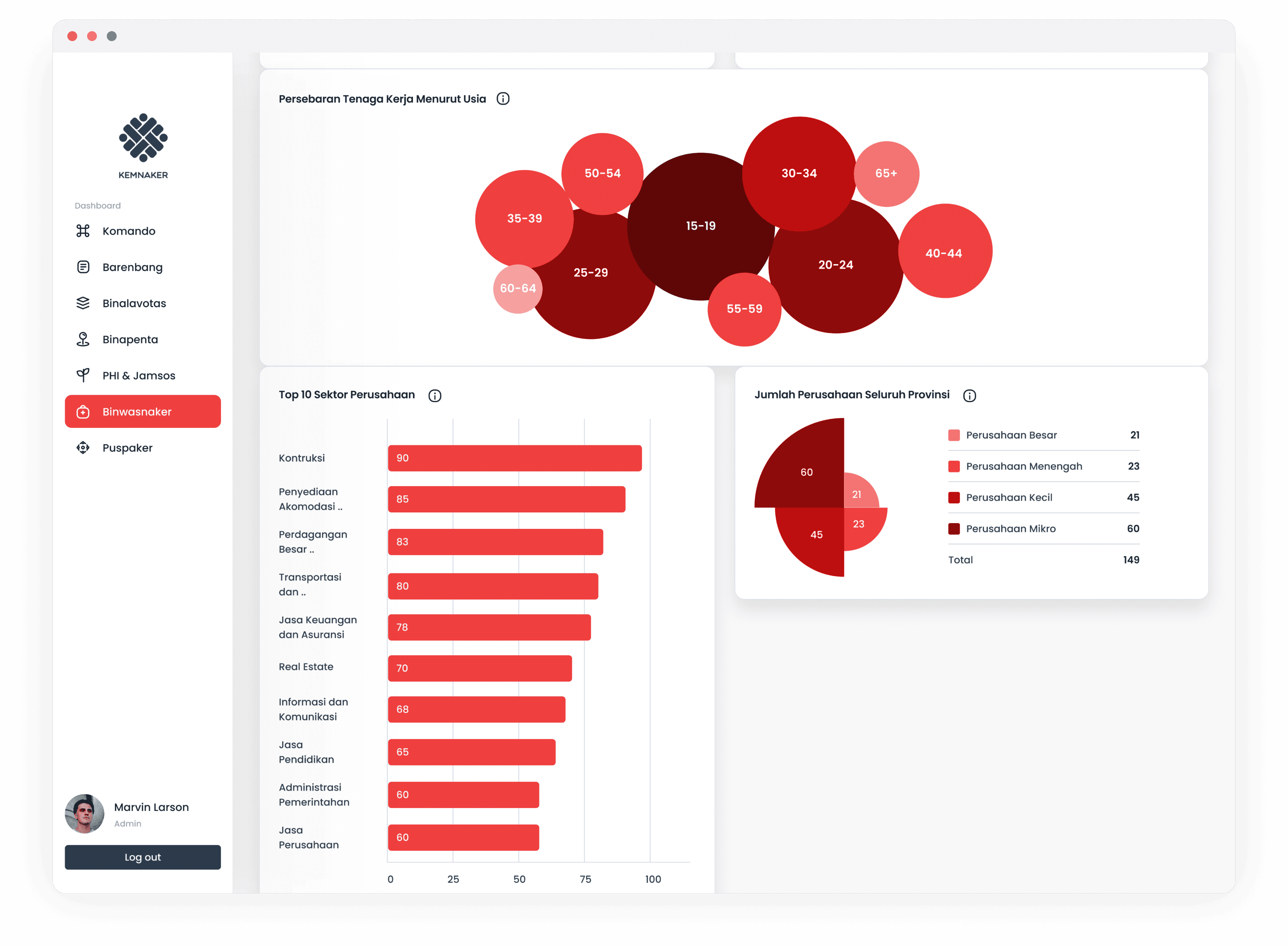
The goal was to present large and complex data, mostly numbers, in a way that could be easily understood by a wide range of users.
I focused on selecting the most suitable visualizations such as tables, charts, or pie graphs depending on the type of data. The priority was to ensure clarity and accessibility for both experts and everyday users. The layout was designed to be intuitive so large sets of information could be digested and interpreted without overwhelming the audience.